
Sometimes the biggest difference between good and great is a subtle difference that isn’t obvious at first. Understanding the importance of color and light quality in a space is one of those things.
Now when I say light quality, I don’t mean the quality of the light fixtures that hang in your home. Don’t get me wrong. Lighting can do amazing things for a space but this isn’t about outdated ceiling fans or cool kitchen pendants.
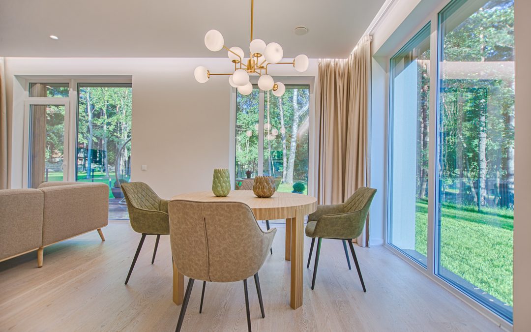
Light quality is defined, in the book of Stella, as not only the amount of light that comes in the house but how it is refracted by what’s in the house.
When I started staging I learned the importance of this the hard way. Yep, I got it way wrong at first. I remember staging a brand spanking new home that had white clean walls, grey washed perfect floors and really shiny chrome fixtures and hardware. Now upon that beautiful canvas, I added muted neutrals, some worn brass and gold accent tables and natural warm tones like burlap and Jute. Muted means color that is softer or in between colors. Can you picture that for a moment?
Let me just cut to the chase, earthy and warm tones was not the right match for this home. Once all of the furniture was in place, I saw the error of my choice and hated it. Like I mean, “could-not-leave-it-that-way,” hated it. I changed the whole package out to sharp neutrals, meaning solid white and grey. Sharp neutrals have NO textures. I also brought in saturated color to add a pop and the space thanked me. By saturated color I mean solid tones that are very confident in their color presentation-Think BAM color!
Conversely, I have made the same mistake of putting ultra white shiny furniture in an older home and it’s just not a match.
There is of course some design leeway for introducing different tones, but the base of the design will look better if it speaks to the light quality in the home. Again, that’s the amount of light coming into the home and how it is refracted by what is in the house… like the fixtures, color on the walls, flooring.
Here’s another example to make sure you ‘get it’. Let’s take a 1950’s ranch home with lower ceilings, warmer wood tones of trim and flooring and fewer windows. In that case it is very complimentary to the light quality to add muted neutrals with warm accents and fun textures.
Got it now?
Knowing when to use high contrast(White is white and dark is dark but it doesn’t have to be black), saturated color, neutrals or sharp neutrals, earthy and warm or modern and cool can take a good space and make it great!
I encourage you to take a look around your home and make sure the design matches the light quality. If not, that may be the missing link you have been searching for! Of course, I am happy to help you if you are just ready to move on. Let’s get to staging your current home so you can find a new home to love.