
The idea of choosing the color palette for your home fills some people with angst. It’s not unusual to see social posts on mom groups from someone needing help picking the color of kitchen cabinets or finding the right shade for a living room.
In fact, for some people the fear of picking the wrong color creates a condition known as paint paralysis. This is true whether you are picking an actual color or trying to choose the right white! Yeah, I wrote a whole blog to help you with that too.
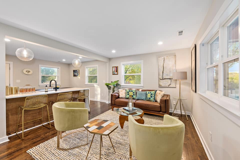
I’ve found a lot of winning color combinations over the years as a Stager. One of my favorites is Olive Green, Maple, Taupe, and Chamois (which is a brown-peach that mimics the color of the beautiful, supple tan leather made from the European mountain goat of the same name). These natural earth tones are appealing and functional and tend to be perceived as warm, reassuring, and settling. It’s a great palette for an open concept living-kitchen-dining room.
But alas, not everyone can enjoy my chic expertise. So allow me to give you a little inspiration for finding your own perfect palette.
Check your Closet:
If you examine your wardrobe you’re likely to find that you wear a lot of a certain color. Most likely, it’s a color you look good in and already like. Why not use it to build the color scheme for a room in your house.
Awesome Art:
I love love love art. I support local artists in my stages regularly and use their pieces as the foundation for many color schemes. Artists have an eye for appealing color combinations.
Fabulous Fabrics:
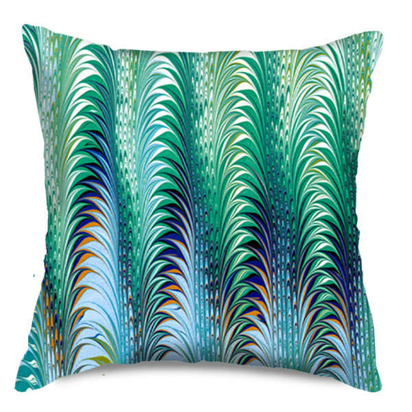
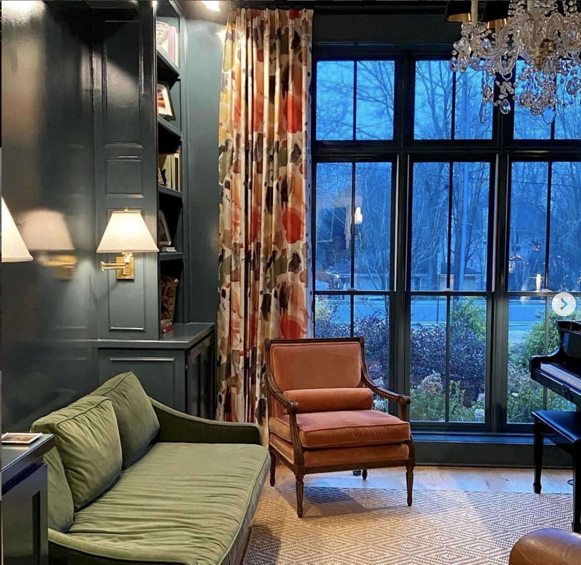
Textile designers, like artists, create colorful and unique designs in beautiful colors. Fabrics can be a launchpoint or unifier for a color story in a space. Pillows, drapery and upholstery can set a tone for a seaside location or a gentleman’s lounge or offer a multitude of colors that can tie together disparate room accents.
Charlotte artist Jill Seale’s marbled fabrics are truly inspirational and a fantastic way to create a color palette.
She’s already done the hard work for you finding just the right color combinations! All you have to do is build off of the majestic foundation she designed.
Like all elements of design, from time to time, certain colors are trending. Did someone say Gray?. Be careful that you don’t go too trendy in choosing a color or you’ll quickly find your home feeling dated. Here’s a fun website you can play around with to find some interesting color ideas. You can also search paint manufacturers’ websites for color ideas.
The color wheel can also help you find the perfect palette.
- Monochromatic: uses different tones of the same color in the same room.
- Analogous: uses colors that appear next to each other on the color wheel.
- Complementary: uses contrasting colors that are usually opposite to one another on the color wheel.
When applying the colors you’ve chosen throughout the space consider the 60-30-10 rule. The dominant color will take up 60 percent of the room (think walls). 30 percent can be used with the secondary color (fabrics, curtains) and 10 percent is your accent color(accessories).
And if you find a great color combo let me know about it! I’m always looking to push the color envelope….