January ushers in lots of big announcements. Entertainment fans are riveted to the Golden Globes. Economists anxiously await the first jobs numbers of the new year. And designers and stagers(like me) wait to hear what the color of the year will be.
Color is critical in any design or staging. Different colors evoke different emotions. There’s a whole psychology to what colors to wear. Colors say a lot about our vibe. You know the power red tie. Is anyone feeling Goth black?
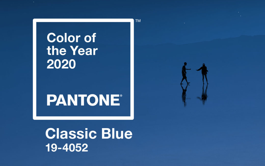
This year’s Pantone color of the year is PANTONE 19-4052 Classic Blue . The company calls it comforting and relatable. The Pantone Color Institute’s Executive director says the color offers the constancy and confidence fitting for living in a time that requires trust and faith.
Other paint brands have announced their own color of the year. If you want more ‘it’ colors check out this list.
I am a big fan of color and like to use it in unexpected ways in my stages.
Here are a few things you can do with the color of the year in design.
Paint the front door. This new blue color would look great with all the gray homes you see these days.
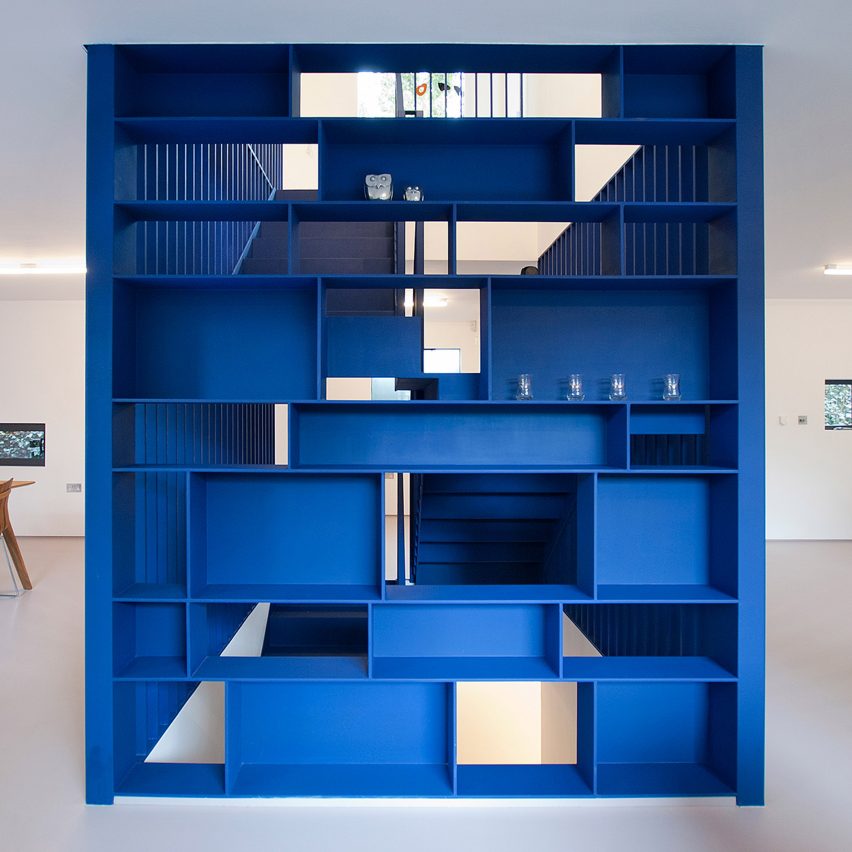
On a bookshelf.
Add color to kitchen cabinets or the island
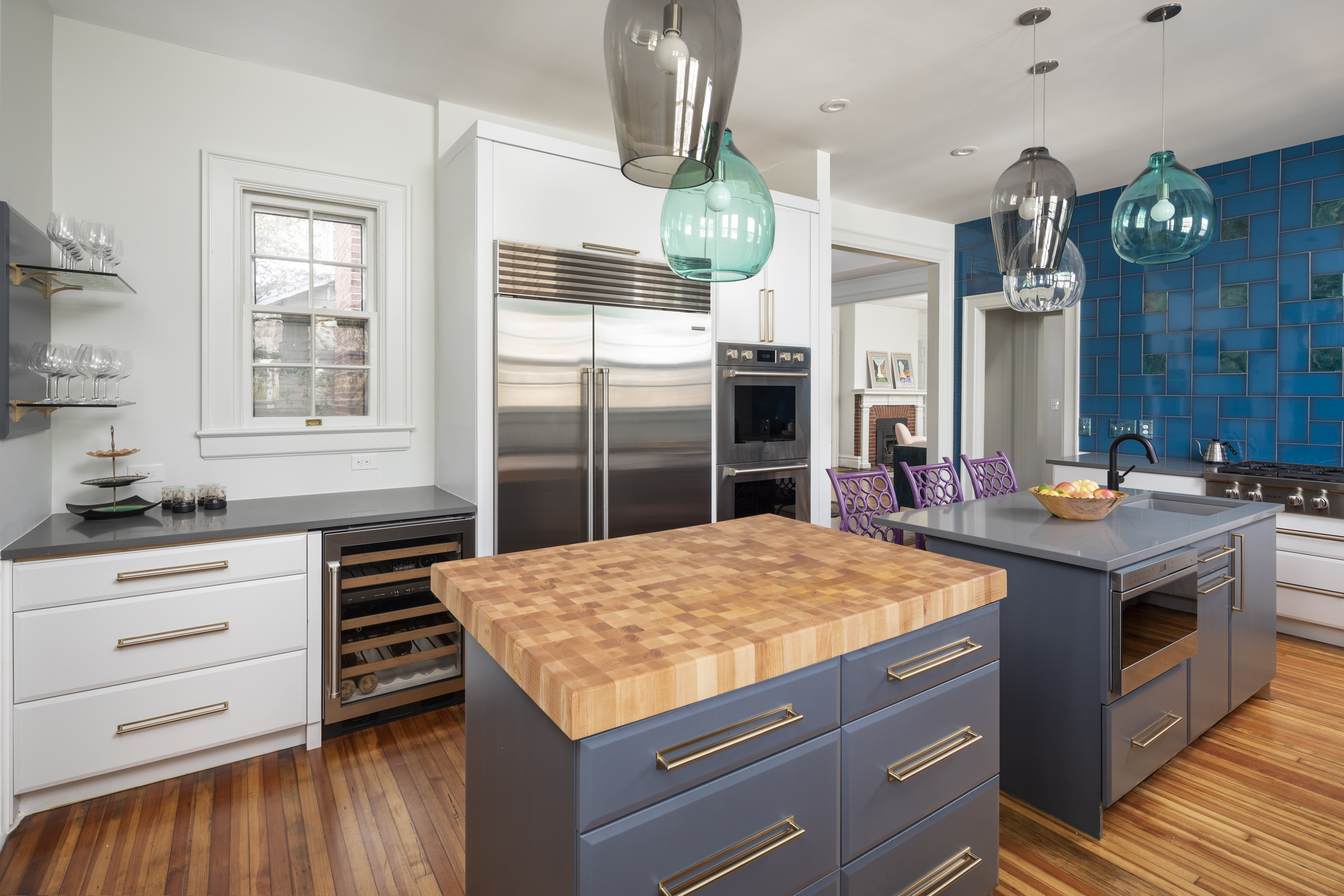
(Look, the island in my own home is already blue! I’m a trendsetter)
In a kitchen backsplash. Yeah, I did that too.
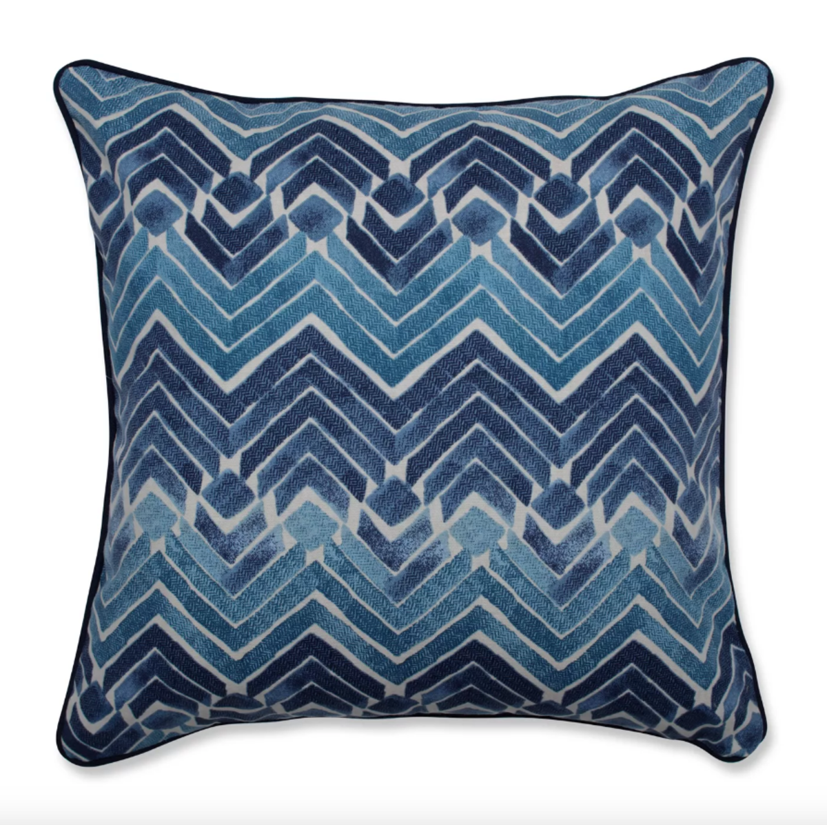
As an accent to furniture… Think blankets and pillows. Yep, manufacturers are already on it.
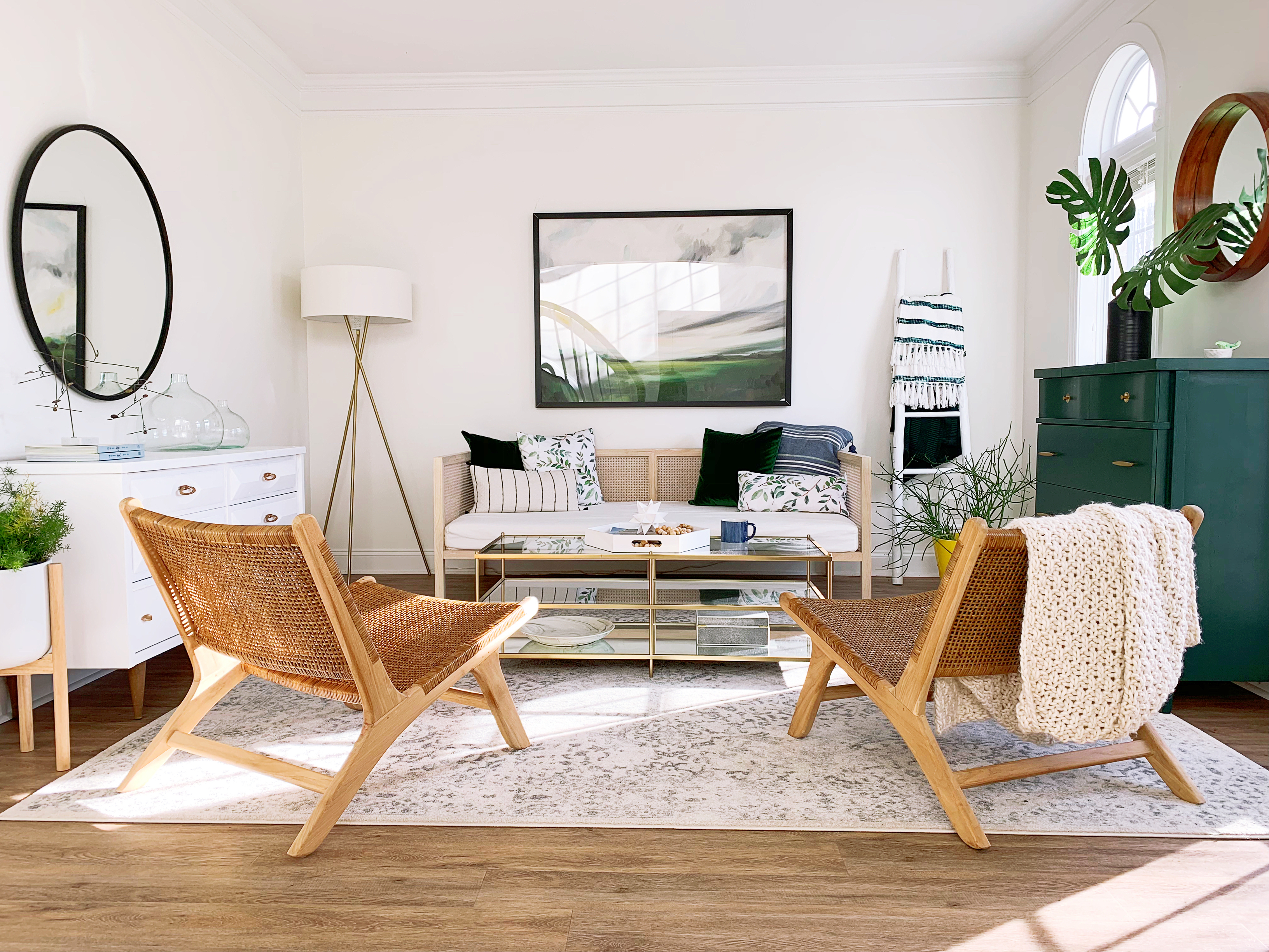
I also like to really get bold and have a neutral palette except one anchor piece of furniture like a big Chair or a console.
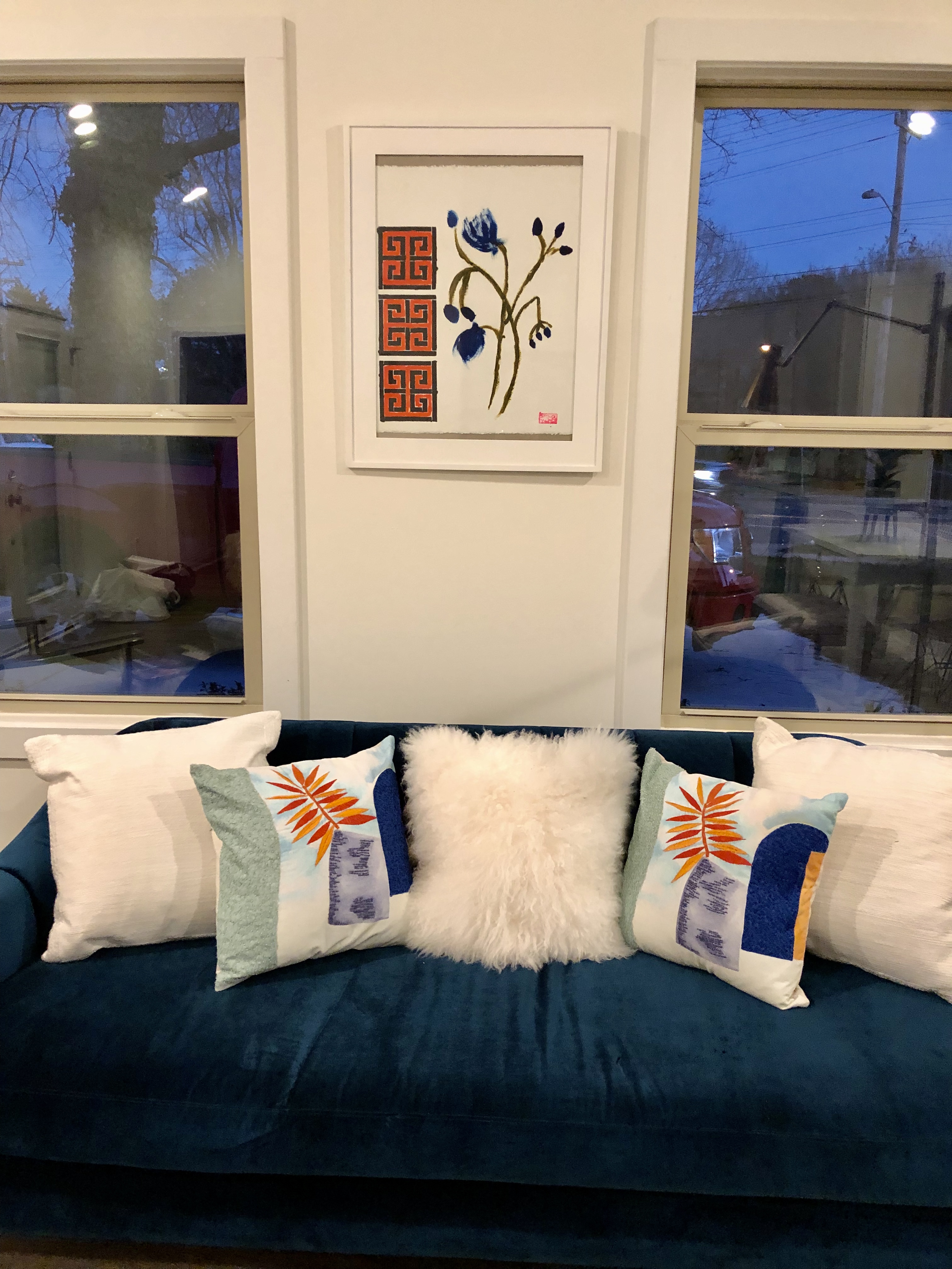
I also like a monochromatic piece of artwork with one bold color as the subject of the painting.
Another really fun thing to do is layer a color family. Just keep heaping it on. Don’t stop with the furniture go rugs, artwork, soft goods go for it. Shoot you can even do walls. Go to Pinterest and type in layering color in interior design and, if you are like me, you will be entertained for hours.
The whole “color of the year” phenomena started 20 years ago. 1999’s color was Cerulean.. a serene shade of blue. Having a “life comes full circle” moment? Me, too.
Now, remember, colors come in and out of style just like anything else. Just like our love affair with gray everything is shifting back to a more neutral palette, so too, will Classic Blue eventually become passe. Keep that in mind when choosing how much and when to use it.
And if you don’t like color well there are plenty of white’s to choose from that actually add color without adding color to your room.
But for now, ride the wave. Get it? Waves. Water. Blue. Make that PANTONE 19-4052 Classic Blue.