Nature inspires me. I love designing with fruits and flowers and I’m obsessed with bugs, bones, feathers and shells. That’s why I am so excited about the 2023 colors of the year. Each year, paint companies reveal the “it” color for home décor. When the selections are revealed I’m like a fashionista drooling over red carpet couture. This year’s colors are soft, bold, calming, invigorating and all connected to nature.
KRYLON COLOR OF THE YEAR – SPANISH MOSS
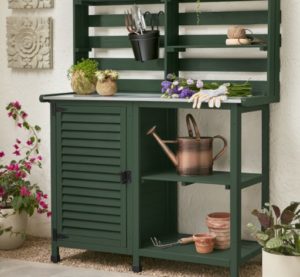
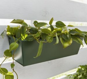
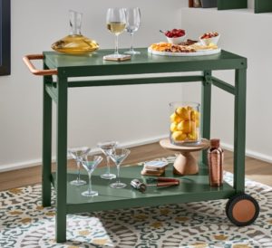
Y’all, this color takes me to the sprawling porch of a Savannah manor. The deep, rich color is like the shiny leaves of a magnolia tree. It’s saturated, dark and comforting. Krylon Senior Color Designer, Ashley Banbury says it works with both warm and cool accents.
HOW TO USE IT
Spanish Moss is a fabulous color to refinish weathered Adirondack chairs, spruce up a garage sale tea cart or give old wicker pieces a rich new look.
DUNN-EDWARDS COLOR OF THE YEAR – TERRA ROSA
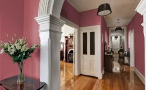
I imagine painting a room this color would be like living in a field of perfect little tea roses. Dunn-Edwards says it picked this hue because amid global chaos, we need colors that are both powerful and comforting. The combination of terracotta and dusty pink is earthy and feminine.
HOW TO USE IT
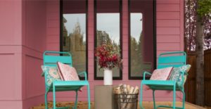
Terra Rosa can be used as a new, bolder neutral or as a gentle accent. I think it would be a beautiful color for a bedroom, a foyer or even a porch. On its website, Dunn-Edward shows it paired with turquoise which couldn’t be cuter.
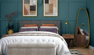
SHERWIN-WILLIAMS COLOR OF THE YEAR – REDEND POINT
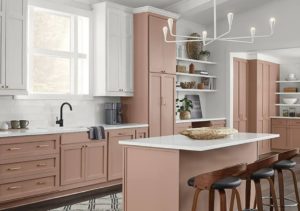
Like Terra Rosa, this color is in the mauve family but Redend Point is lighter and softer. This is the kind of hue that envelops you like a fuzzy blanket.
HOW TO USE IT
Go wall-to-wall with Redend Point. Add neutral furniture and accent with grays and browns for an earthy yet sophisticated look. Sherwin-Williams shows it on kitchen cabinets and the look will blow your mind. This is not your mother’s sunny yellow kitchen; this is a modern masterpiece that is both soft and crisp.
BETTER HOMES & GARDENS COLOR OF THE YEAR – CANYON RIDGE
Now, let’s take that earthy neutral and add a little coral. This color captures the glow after a southwestern sunset. It’s a bolder neutral that won’t look dated in a few years.
HOW TO USE IT
I said a couple of years ago that gray is passe. Canyon Ridge is the perfect antidote. Better Homes & Gardens shows it on an accent wall with an off-white stencil on top. It’s amazing. This color pairs perfectly with blues – bright cobalt, classic denim or sleek navy. Not ready to give up the gray just yet? Paint a bookshelf, a bench or nightstands in Canyon Ridge.
GLIDDEN COLOR OF THE YEAR – VINING IVY
This is a green-blue jewel tone that reminds me of hydrangeas. It’s kind of green, kind of blue and 100% luxurious. It’s masculine and feminine all at once, which might make it the perfect bedroom color choice for couples struggling to find just the right shade.
HOW TO USE IT
Could you imagine Vining Ivy on kitchen cabinets? (Swoon) This lush color would also be fabulous on a front door. Anywhere you have deep wood, rich leather or stone, this color would work.
DUTCH BOY COLOR OF THE YEAR – RUSTIC GREIGE
If you must go gray, this is the way to do it. Dutch Boy says it’s what the world needs right now: deep-rooted comfort. As the name suggests, it blends gray and beige for an updated neutral that goes with absolutely everything.
HOW TO USE IT
Rustic Greige is an all-over color that works in the family room, the bedroom and everything in between. Pair it with soft yellows, pinks or blues for a botanical look.
VALSPAR COLORS OF THE YEAR
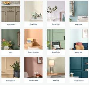
Valspar narrowed it down to 12 colors of the year. And while that sounds just a bit indecisive, this collection of colors provides a roadmap for transforming your home into a picture perfect estate. The colors range from soft and subtle to rich and lavish.
HOW TO USE IT
There are endless possibilities to mix and match the colors Valspar has curated. Everglade Deck and Cozy White would make a striking dining room or powder room. Desert Carnation would make for an inspiring home office or guest room. Gentle Violet would be an exquisite master bedroom color. Valspar shows Ivory Brown on kitchen cabinets that look both modern and neutral.
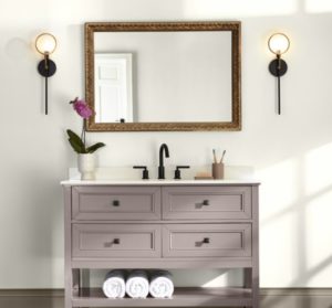
BEHR COLOR OF THE YEAR – BLANK CANVAS
![]()
As Behr says, “not every 2023 color of the year aims to make a statement.” Maybe the statement here is that by painting your walls in Blank Canvas, your personality and creativity can shine. It’s a creamy shade of white that doesn’t distract from anything you choose to highlight. It’s why art gallery walls are painted white.
HOW TO USE IT
Blank Canvas is just that; it’s a blank slate with endless possibilities. I wrote in 2019 about choosing white walls in a renovation. It allowed me to showcase some beloved art pieces and bring light into some naturally darker areas of the home. But choosing the right white isn’t always easy. You can read more about that here.