As a home stager and a design-loving kind of gal, I look forward to the annual reveal of the color of the year. Some people wait for Academy Award nominations, I wait for the color of the year, what can I say. After the especially up and down year of 2020, I wondered what was next for the color of the year 2021, and what it might reveal about our states of mind.
Without further ado… here are the colors of the year and my armchair psychiatrist take on them.
Benjamin Moore’s Color of the Year 2021 is Aegean Teal.

It conjures up images of calming poolsides and relaxing beachy getaways. Given the anxiety of last year, a color known for its association with peace, calm and comfort is a welcome addition to housing pallettes everywhere. Ocean blues are being recognized as a key color trend for the year.
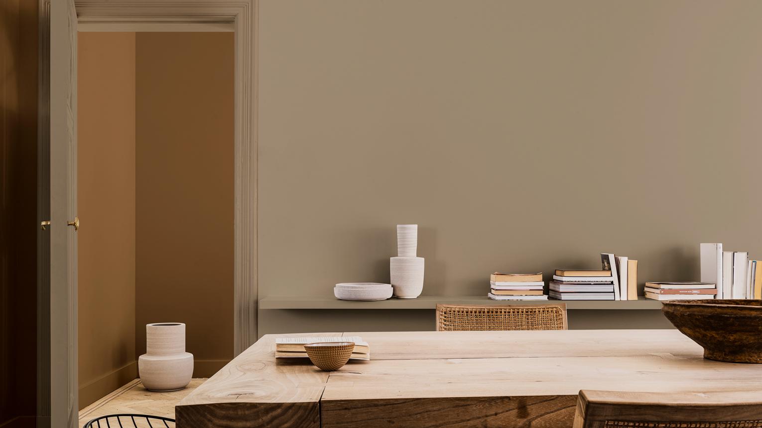 The First Dulux Color of the Year is Brave Ground.
According to their website, their color experts call the color a “bolstering shade that connects back to nature and the simple things.”
Brave ground is warm and earthy. Earth tones tend to provide a feeling of stability. Who couldn’t use a little more stability this year? (me, raising my hand). The neutral color will work with many styles. For people like me who like to brighten up a space with pops of color and creativity, it’s light enough to do that.
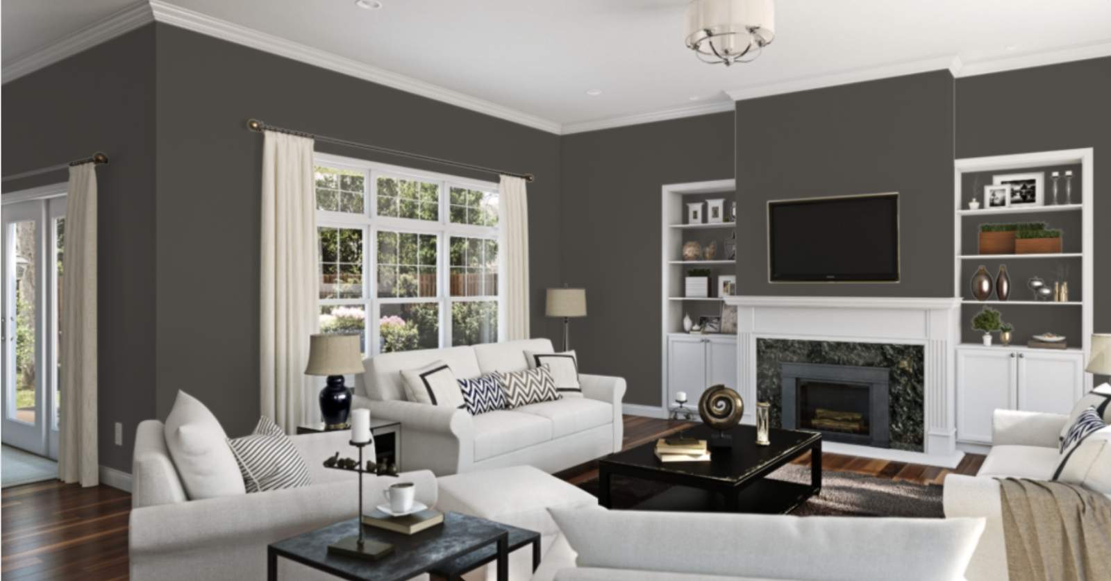
Finally, Urbane Bronze has been chosen as Sherwin Williams’ Color of the Year. That is not a typo. It is urbane, not urban. I had to look twice.
Urbane Bronze SW 7048, is a rich, warming shade. It too is supposed to lend comfort while also exuding confidence. Truthfully, some people have a hard time visualizing the use of a darker bold color, so maybe the confidence description makes sense.
I’ve been doing a lot of reading lately about new design trends and want to share a few other interesting color notes for you.
Gray is moving out as a preferred color in the kitchen. Greens are expected to be big in kitchens in 2021.
I love a pop of unexpected color in unexpected places. Think the back wall of a media cabinet or drama in a small bar area or butler’s pantry or a laundry room.
I do love color, really I do. Lately, however, I have renewed my love for white. I’ve even counseled my listing clients to paint all-white interiors in their homes. White really makes for a clean fresh open look that lightens the space. It is also perfect for artwork display and introducing color via furnishings, rugs, and other decor.
My go-to white right now is Chantilly Lace by Benjamin Moore. It has a drop of warmth.
By the way, I go to the Benjamin Moore store and talk to their color specialists. They are so incredibly helpful. With the help of color specialists, I have found some amazing paint colors and paint quality. You may not realize what a difference a higher quality paint can make.
Happy painting