Take a look at this home I recently staged.
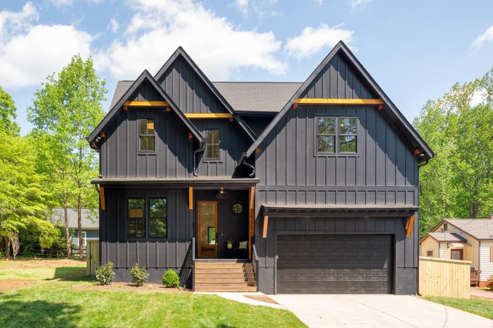
Moody exterior, right?
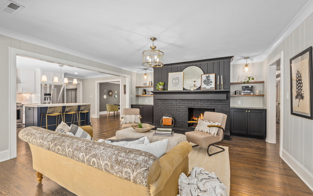
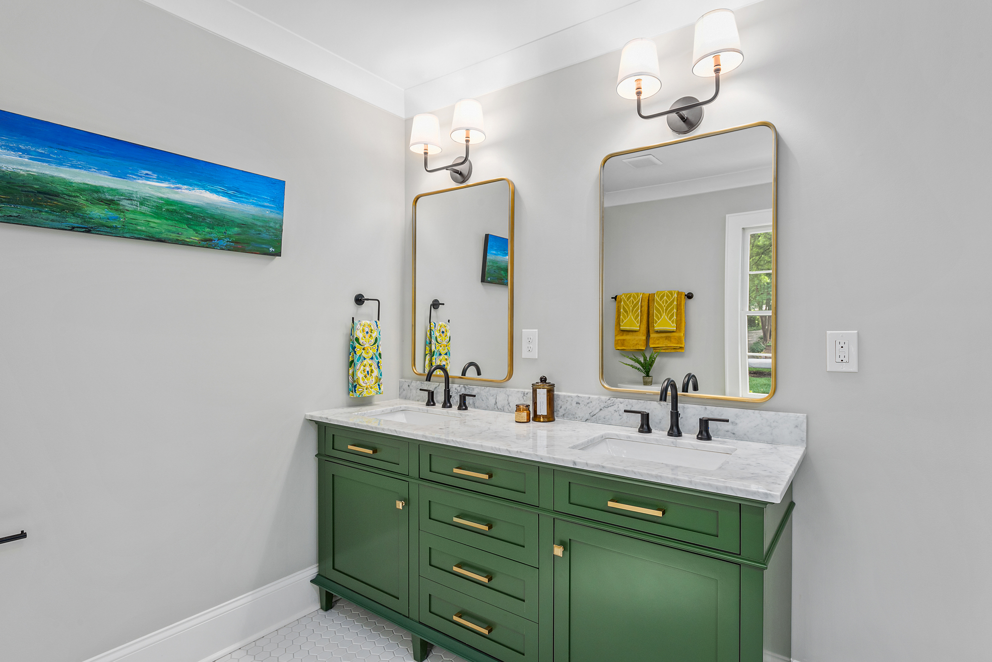
Now the interior.
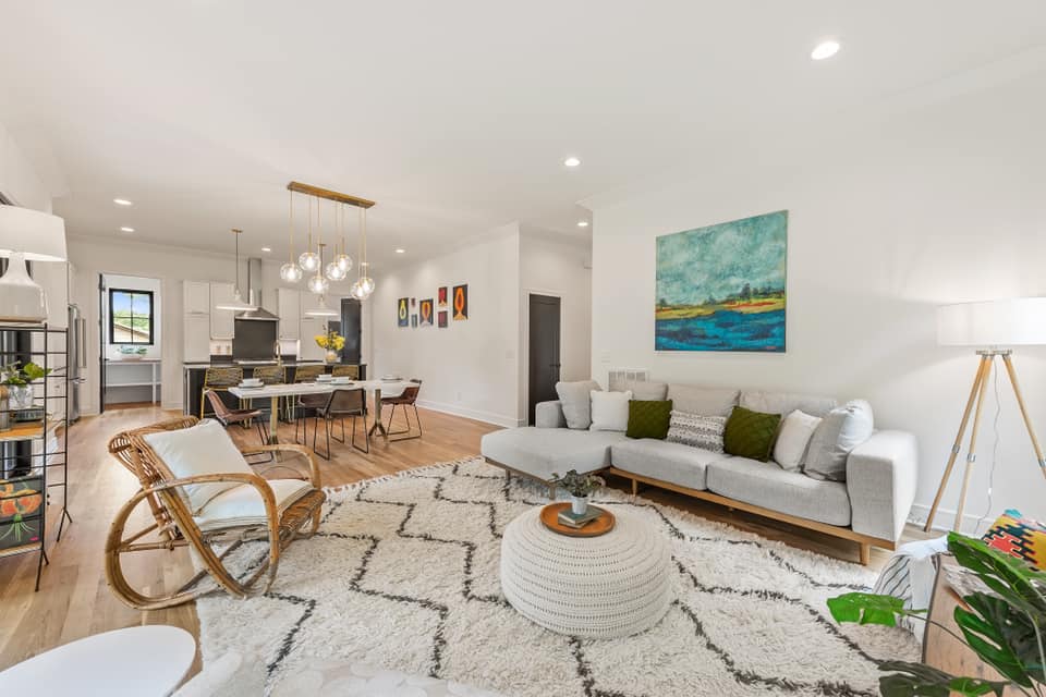
Light and bright, wouldn’t you say?
That is contrast at it’s finest. Sidenote: I have recently become a bit obsessed with the dark modern farmhouse look. (Anyone else?) It’s classic and striking but still welcoming and warm.
This gorgeous THR Design Build home for Anne Monsted of Kindred Realty is a great example of how contrast can work in home design. In fact, it doesn’t just work… It’s the secret sauce for creating an impression.
Contrast brings a space from flat to full… from blah to bam from meh to memorable!
Contrast stimulates visual interest and, I might add, sparks conversation. There are several ways to incorporate contrast into the interior design of your home.
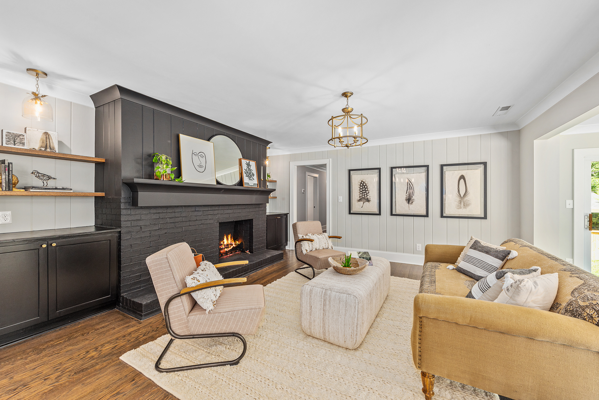
Don’t be afraid of the dark
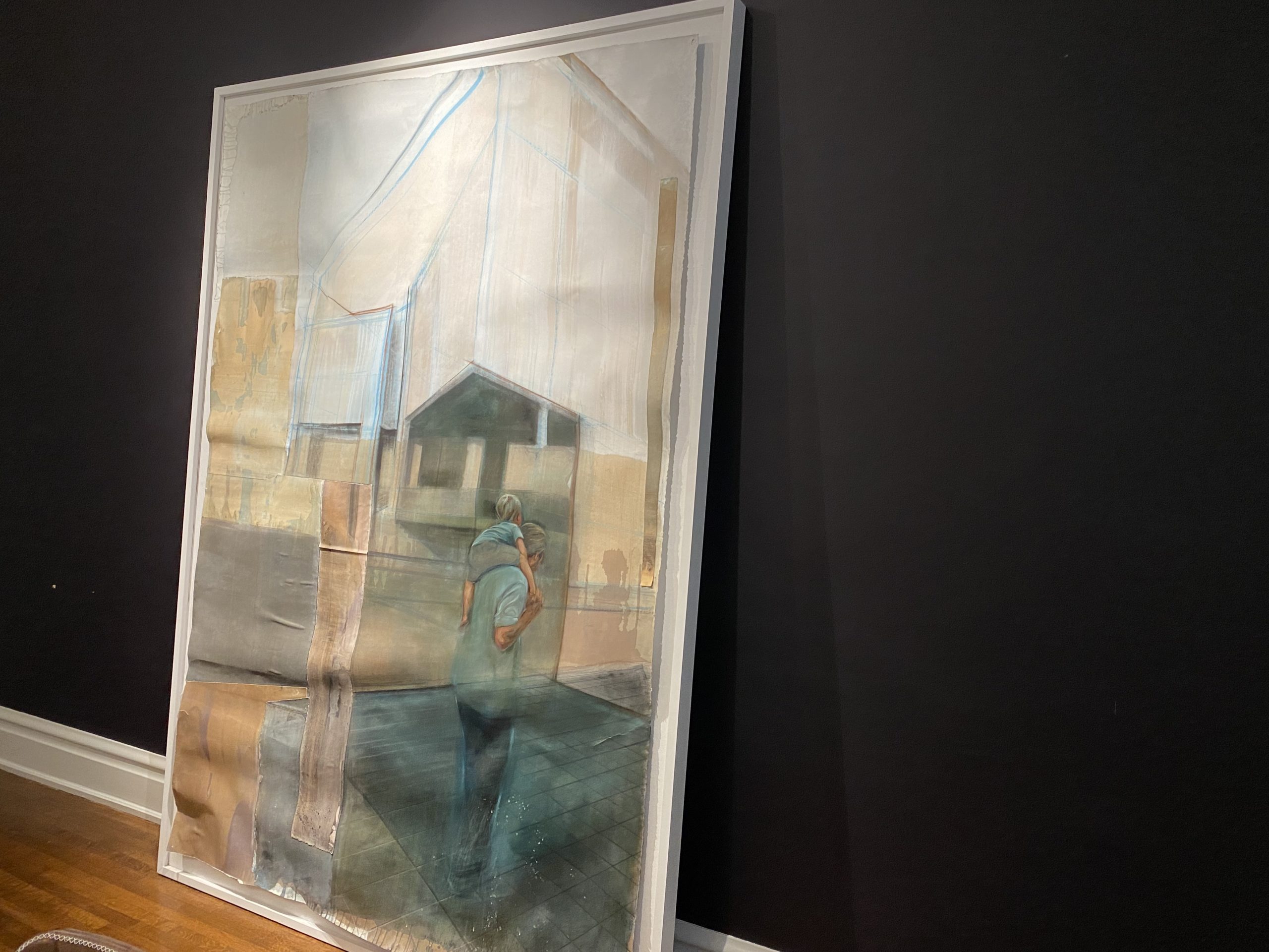
The range for adding contrast can be as subtle as Black and white photography and sketches on your walls and black frames on wall art…. To a whole black wall, like I did in my own home.
Actually, I painted 2 large walls in 2 different rooms with a very dark eggplant paint color that reads black.
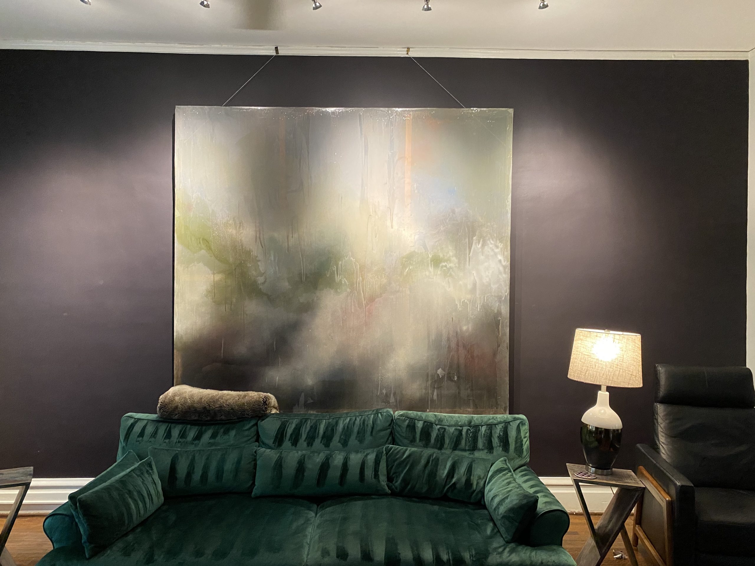
I wanted to create drama and a background aka gallery wall for some of my large-scale artwork.
Keep in mind the rest of my house is very white. Black is on trend right now, so there are a lot of really cool black furniture pieces out there that I am digging. West Elm has some of my favorites.
Color
This is an area where most people can understand contrast. Think the classic color combination of black and white.
- A statement wall of color on an otherwise neutral palette.
- A solid color couch with patterned pillows.
- The effect works. The contrast gives a depth to the room.
Texture
This is another area where contrast can really work but is sometimes overlooked. You may have noticed that texture is a big aspect in design trends . Contrasting textures means pairing something like rough and smooth in close proximity to each other.
- Rough fabrics on sleek, modern furniture.
- A textured light fixture over the top of a smooth granite countertop.
- Contrasting materials like wood and metal or stone and steel work in much the same way. It’s the balance you didn’t even know the room needed.
Shapes and Forms
Speaking of balance, contrasting a variety of shapes is another way to use contrast in your design. Sharp and angled against smooth and rounded.
- A large something offset with a small something.
- A round mirror over a rectangle cabinet.
- This works as well for furniture as it does for art. It makes an impact!
Play around with low-contrast and high-contrast styles til you find the one that works for you.
Now I have to give a warning with this design advice… don’t go overboard. This effect works when it’s done subtly and not, overdone. Keep the rest of the space more subdued or neutral.